Small, useful, and obvious once you use it
Claude can build something that looks like enterprise software in an afternoon, so that is no longer what I want my GitHub to show. I would rather build small things that are genuinely useful, where every decision was made on purpose, and where the person using it finds those decisions obvious.
Start from a real annoyance
Not from a gap in a portfolio. If it doesn't bother me, I won't build it well.
Small and finished
One problem, solved properly and shipped, beats a large app that does everything generically.
Thoughtful should feel effortless
If the user has to stop and think about a decision, it was the wrong one.
Under each project: the decisions you'd notice using it. Open one to see why it's built that way.
Lantern: the A$550 feature on a A$49 light
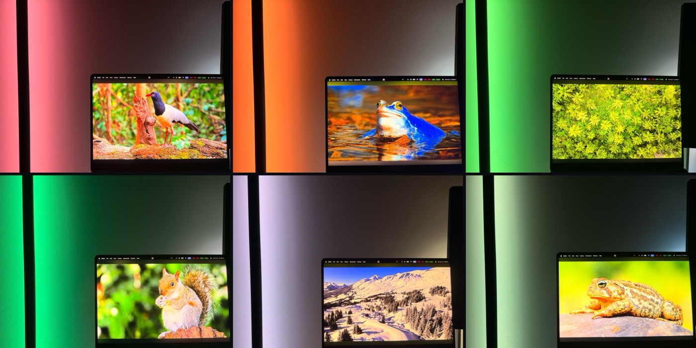
Philips Hue sells screen-synced lighting for about A$550 of hardware. I bought the cheapest Bluetooth LED bar I could find, worked out how it talks, and built the missing piece as a Mac menu bar app.
It lives in the menu bar
Lighting is something you set and forget. A full window would ask for attention the job doesn't need, so Lantern stays one click away and otherwise out of sight.
A dark scene doesn't switch the room off
Black often covers most of a film frame. If a strong colour covers even 10% of the screen, it wins, so the light follows the scene rather than dropping out whenever it gets dark.
Colours look right, not pastel
A screen and an LED mix light differently. A calibration tool showed that gamma, not saturation, fixes it; the full story is in a note.
The calibration tool ships with the app
My numbers suit my bar. Another bar will need its own, so the tuning tool is part of the app instead of my values being hard-coded.
TokenEater, multi-account: two accounts, no confusion
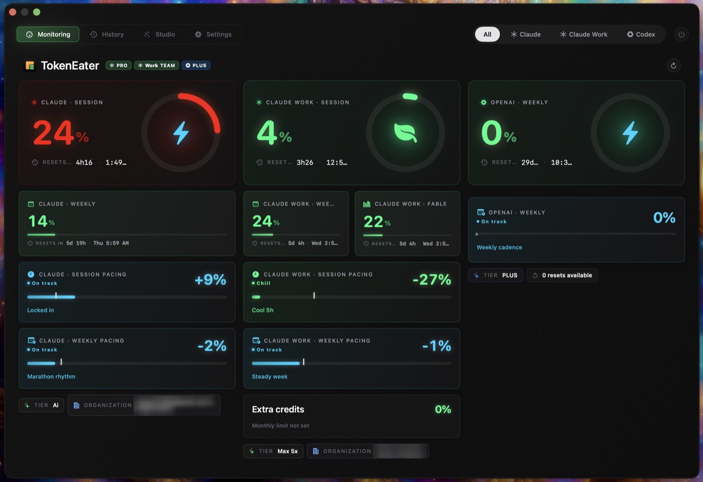
TokenEater is an open-source menu bar app that tracks Claude usage, for one account. I use two, personal and work, so I made it track both.
The second account appears everywhere the first does
Menu bar, popover, dashboard and Studio. A second account that only shows up in one place is a feature you have to remember exists.
It never reads your secrets
It finds the second login by the Keychain item's presence alone. A usage tracker has no reason to touch credentials, so it doesn't.
It can't overwrite the official app
The fork ships with its own app identity, so installing it never replaces or breaks the real TokenEater, and a clear warning points people to the official version.
It went upstream, not just sideways
I proposed it to the original project as pull request #284, so if it's useful, everyone gets it.
FoodLens: the right fact at the moment of purchase
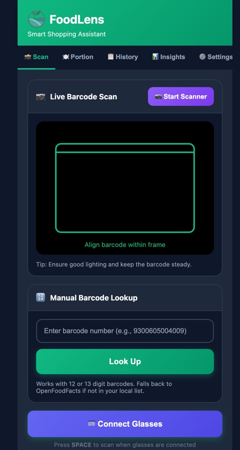
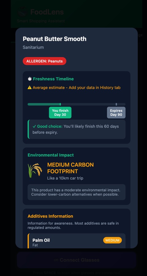
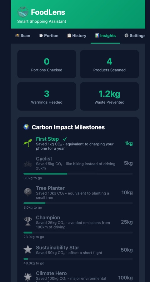
For my ANU HCI final project: scan a barcode in the shop and see what matters to you, before you buy. I built it, ran a study with it, and let the study shape it.
Allergens are matched to your profile
A generic allergen list makes you do the matching in the aisle. FoodLens only alerts on what you said matters to you.
Expiry follows how fast you actually eat
It starts from an average, then switches to your own measured pace once you log what was left. Personal beats generic.
Waste comes before carbon
In the study, tangible outcomes like food waste changed behaviour more than an abstract carbon number, so the design leads with them.
It's a web app, not an install
Nobody installs an app to check one yoghurt. A phone-first PWA opens from a link and works on the spot.
GrowthScope: the benchmark I kept on purpose
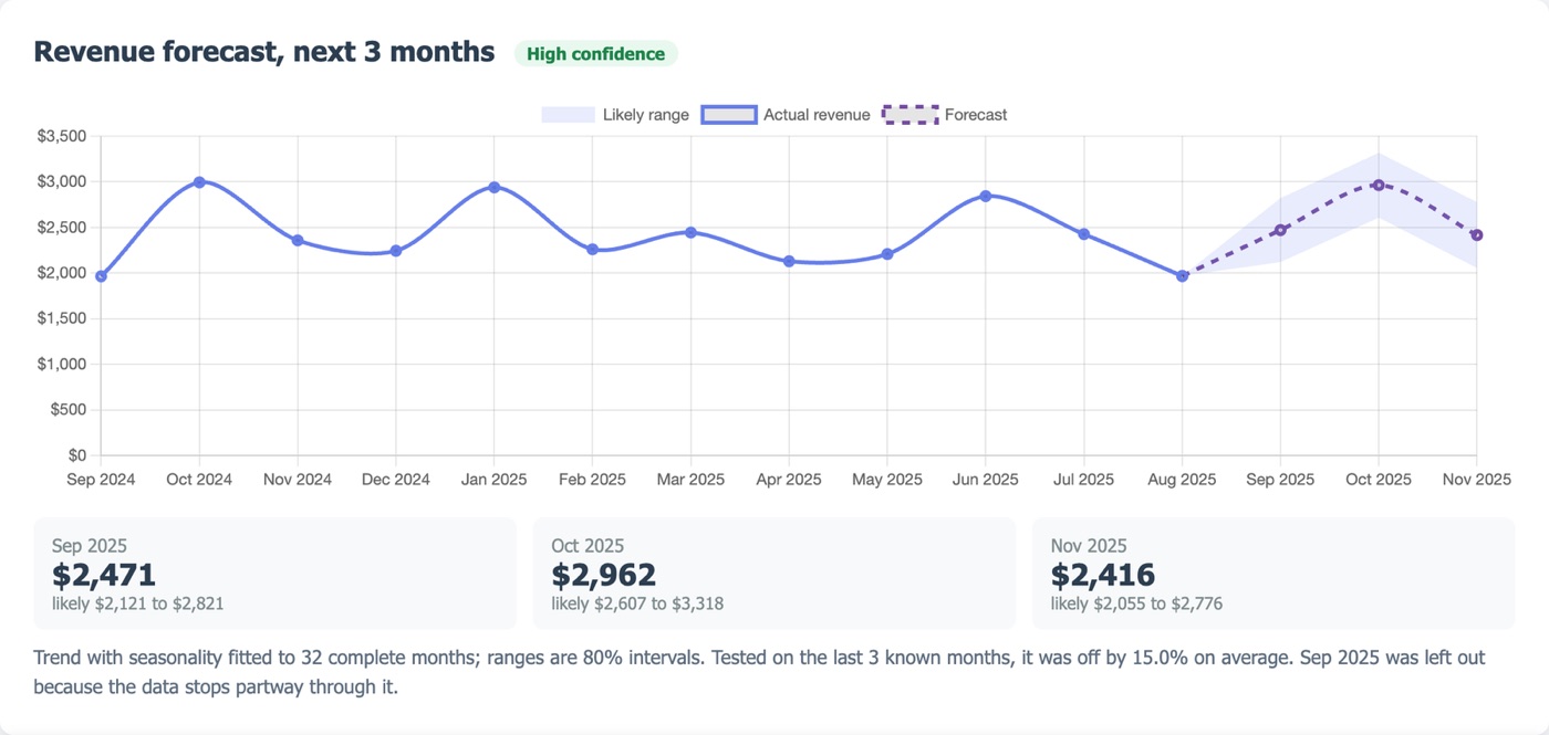
My first hackathon and my first vibe-coded app. It looked finished. A year later I found it analysed only 41% of its own demo data, because Australian day-first dates were silently dropped. I keep it as a benchmark of the gap between looking finished and being thought through.
The forecast tells you how wrong it is
It reports its own error on months it didn't see. A forecast without an error bar asks for trust it hasn't earned.
Unusual days, without crying wolf
The anomaly detector was tuned to raise no alarms on random data, because a detector you learn to ignore is worse than none.
Your columns, your names
Flexible column mapping means a shop's own spreadsheet works as it is, instead of being reformatted to suit the tool.
A check runs before every push
Tests and a gate have to pass first. It's how the 41% bug would have been caught the first time.
The thread
None of these is big. Each started from something that annoyed me, and each decision was made so that the person using it never has to wonder why. That's the bar: thoughtful enough to be effortless.